Client
Janebi Co.
Industry
E-Commerce
Platforms
Website
Team
Project Manager, UX Designer, UX Researcher, UI Designer
Overview
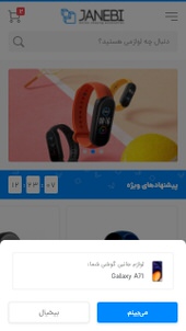
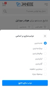
The widespread use of smart gadgets (mobile phones, tablets, laptops, cameras, game consoles, etc.) has led to the creation of a new category of products. Today buying a smartphone is not the end of the story, you also need a number of accessories to personalize your device. Janebi Started in 2011 to be the first gadgets accessories online store. Since then, they have expanded their product range to include accessories for all types of mobile phones and smart gadgets such as tablets, laptops, cameras, game consoles, and etc. In order to provide more efficient Data Structures and increase conversion rates, we have redesigned Janebi according to the analysis of their users’ behavior.
Started In
2020
Week
20
Screens Designed
179
We started theproject with
A request from the « Janebi » team for a website redesign!
Until a few years ago, a redesign project mostly consisted of making the website more attractive, and design teams focused on the business owner’s preferences. Today everyone agrees that the main focus of an interface redesign should be users’ preferences and behaviors.
« Janebi » redesign project was kicked off by making a list of the current website’s problems and requirements, insights into user behavior, and the roadmap envisioned for « Janebi ».
People ignore designthat ignores people
— Frank Chimero
After composing a complete list of new features and data structures for all sections, it was time for a new data structure in Menus.
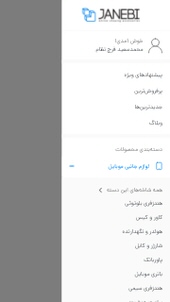
After analyzing the number of clicks on the old website’s menu, data collected from our questionnaires, and ideas we developed from our competitors, we came up with a new combination of menu items and submenu items.
Research, Observation, Investigation, and Analysis
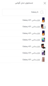
One of the most important redesign tasks in this project was the ‘‘search’’ module revamp, which involved designing questionnaires and reviewing Google Analytics data to get a clear sense of users’ most important needs. In other words, « Janebi » users were our beacon in this stage of the project.
One of the curious points discovered by reviewing Google Analytics data was the unusually high bounce rate on the most viewed pages of the website! The question was ‘‘Why don’t users stay on these pages, aren’t encouraged to add items to their cart, or don’t even look at related products?’’
In short, we were looking for a better understanding of user behaviors through different methods. Considering the large community of « Janebi » customers, we decided to design a questionnaire with various questions about all the departments. The goal was to find the answers to our questions without being overwhelming or tiresome.
After getting enough responses, it was time to analyze the obtained data using tools like Google Sheets, Notion, and Excel. With all the data and analysis, we came up with a list of ”Users’ real needs”.
Your website must beeasy to navigate
After composing a complete list of new features and data structures for all sections, it was time for a new data structure in Menus.
To come up with a new combination of menu and submenu items for the new website, we analyzed the number of clicks on the old website’s menu, data obtained from questionnaires, and ideas from looking at our competitors.
Design Process
00
Kick Off
How finish project successfully?
Define Project Roadmap
Schedule Weekly Meeting
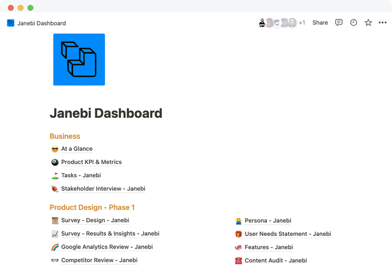
Define Design & Documentation Platforms
Define Handover Tools
Tools Used
Notion
Adobe XD
Zeplin
Handoff
We can always do something more. Handoff refers to the point when designers need to transfer their ideas for development. While it’s primarily the responsibility of the UX team to produce prototypes, assets, and documentation, the design handoff process is a collaborative effort.


